Client · Brand & menu design · 2025
An everyday deli, made to look as good as it tastes.
Applied, commercial range: a charcuterie catalogue and a sandwich system for Diona — every item labelled the way you’d actually want to be told.
Brand & menu design · Art direction
Catalogue · Sandwich range · In-store
2025
The catalogue
The platter, turned into a range.
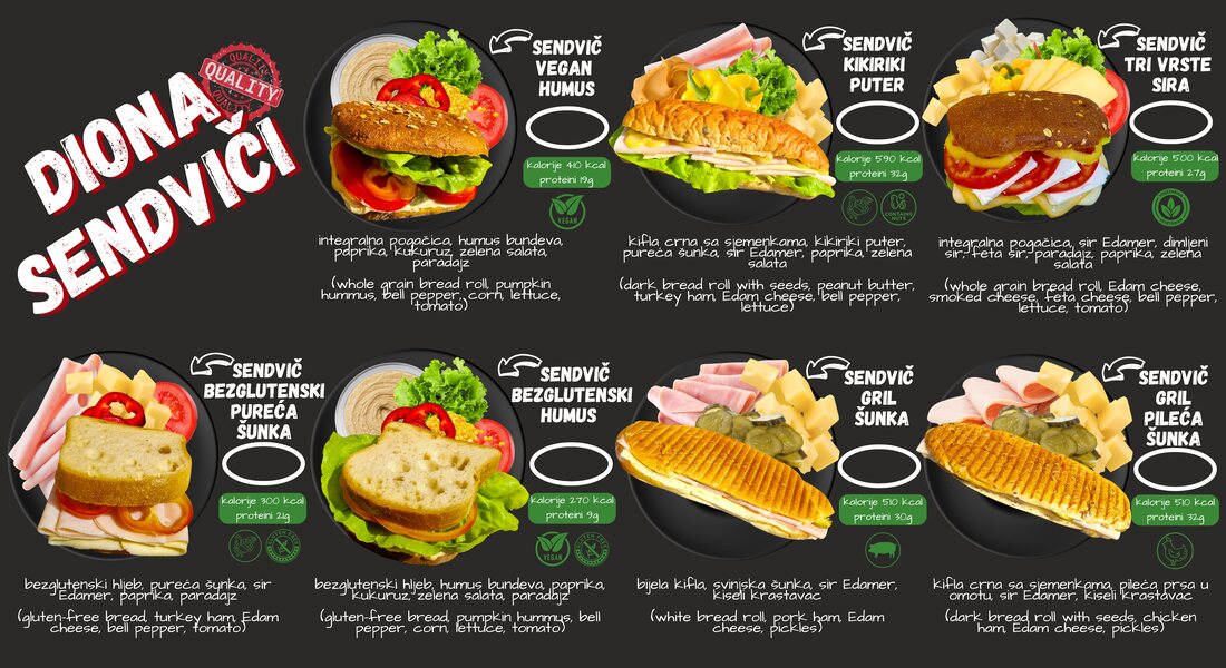
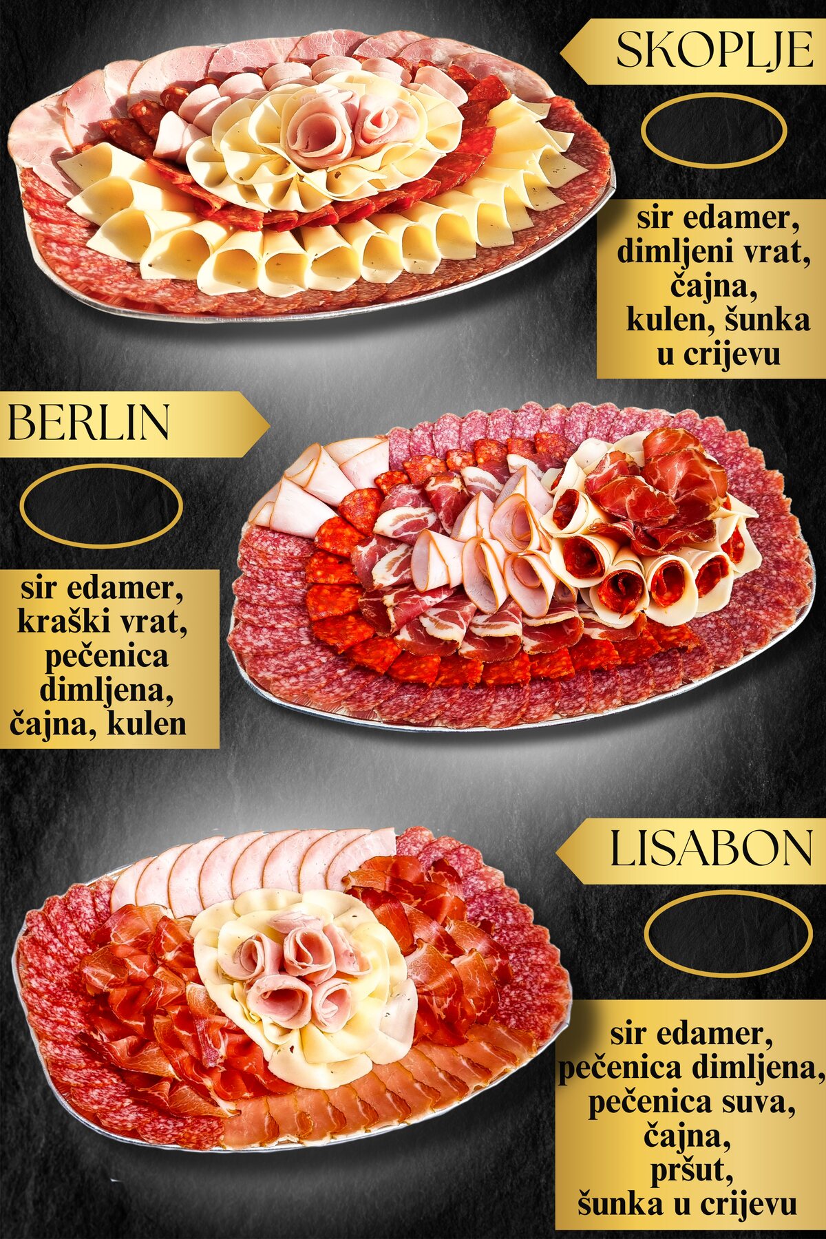
Every board and sandwich became a named product with its contents and weights spelled out — a menu you can read like a catalogue, not guess at.
The premise
Structure the customer can taste before they order.
A neighbourhood deli has better food than its menu suggests. The job was to make the counter legible — turn a platter into a range, label every sandwich like a promise, and put the nutrition up front so the honest, everyday quality reads at a glance.
Three promises, one counter
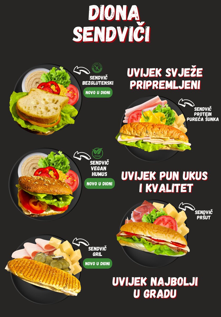
Always fresh. Full flavour. Best in town.
A labelled range
Every sandwich — grill, pršut, vegan humus, gluten-free — named and described like you’d want to be told.
The platter, as a system
Charcuterie catalogue turned into a repeatable, sellable range instead of a one-off spread.
Warmed into a world
Shot on black, then graded into the house palette so even a deli poster feels considered.